Back to the site

Case study · Logistics & supply chain · 2026

FLUX

A web dashboard for logistics operations teams who monitor hundreds of shipments a day. The job: help people see what needs attention right now and act on many shipments at once, without losing their place.

IndustryLogistics & supply chain
RoleProduct design, UX/UI
DeliverablesWeb application, design system
PlatformDesktop web
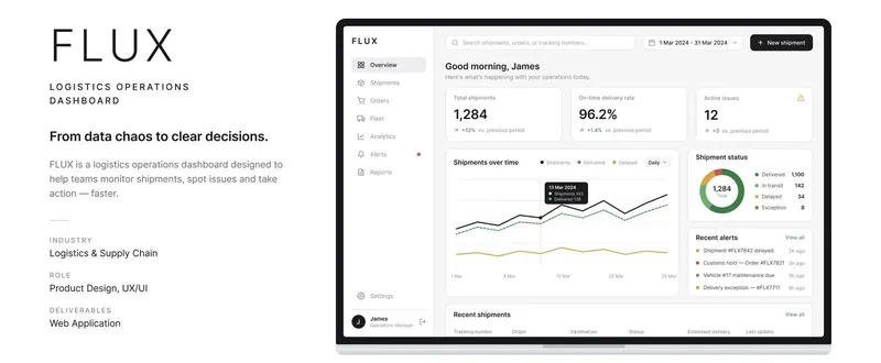
FLUX logistics dashboard overview: total shipments, on-time delivery rate, active issues, shipments chart and recent alerts
The FLUX overview: three key numbers, one main chart, status and alerts.

01The problem

Operations teams start every day with the same question: how are we doing, and what needs me right now? The original dashboard tried to answer everything at once. It showed more than 40 metrics on one screen, charts in different styles and no visual hierarchy, so nothing stood out.

When everything looks equally important, people scan the whole screen every time. The one delayed shipment that actually needs action gets lost among numbers that don’t.
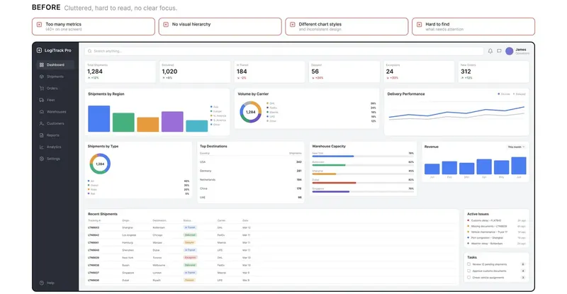
Before: a cluttered logistics dashboard with more than 40 metrics, mixed chart styles and no clear focus
Before: too many metrics, no hierarchy, different chart styles, hard to find what needs attention.

02From 40+ metrics to 3

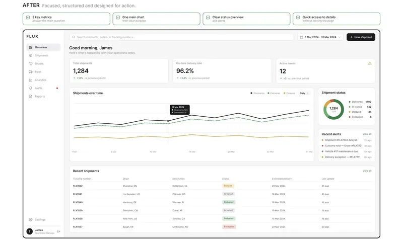
I started from the decisions people make, not from the data that was available. That left three numbers that answer the morning question: total shipments, on-time delivery rate and active issues. Each one shows its change against the previous period.

Under them sits one main chart, shipments over time with delivered and delayed lines, plus a status breakdown, recent alerts and the latest shipments. Everything else moved to the pages where it is actually used.

40+ → 3metrics on the first screen
−70%visual noise
1main chart with a clear purpose
After: the redesigned FLUX dashboard with three key metrics, one main chart, shipment status, alerts and a recent shipments table
After: focused, structured and built for action.

03Built for working in bulk

Operations teams rarely deal with one shipment. On a busy day they create, update and resolve dozens at a time, so the whole product is built around working in bulk, not one row at a time.

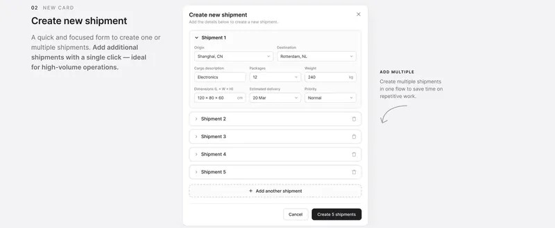
The Create shipment form lets people add several shipments in one flow. Each shipment collapses into a single line when it’s done, smart defaults fill in the obvious fields, and one button creates them all.

FLUX create new shipment form with five shipments added in one flow and a button to create them all
Create several shipments in one go instead of repeating the same form.

04Never lose your place

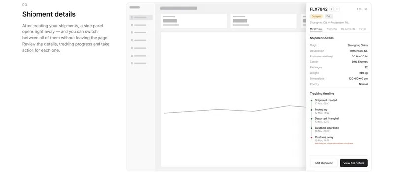
After creating shipments, a side panel opens straight away. It shows the details, the tracking timeline and any issue that needs action, such as a customs delay waiting for documents. People can move between the selected shipments (1 of 5, 2 of 5…) without leaving the page or losing their scroll position.

FLUX shipment details side panel with origin, destination, carrier, tracking timeline and a customs delay warning
The side panel keeps context: details, tracking and the next action.

05A table that does the work

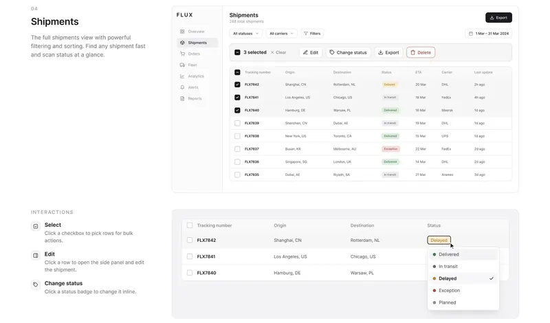
The full shipments view combines filters by status, carrier and date with multi-select and bulk actions: edit, change status, export and delete. Status badges are interactive, so a shipment can move from In transit to Delayed with one click, right in the table.

FLUX shipments table with filters, three selected rows, bulk actions and an inline status dropdown
Select, edit and change status inline.

06Day and night

Operations don’t stop at 6pm. FLUX follows the system theme or lets people switch manually, and the dark theme was designed as a real theme with its own contrast checks, not simply inverted colours.

FLUX dark theme for the overview and shipments pages
Dark theme for early mornings and late shifts.

07Real states, not just the happy path

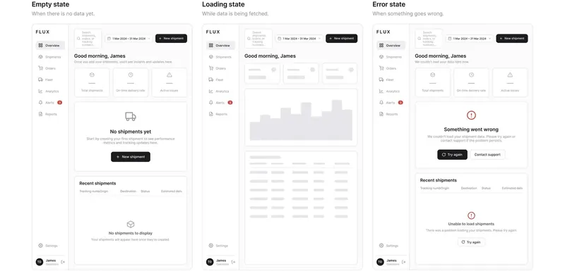
Logistics rarely goes exactly to plan, so empty, loading and error states were designed as part of the product, not left for later. A new account explains what to do first, loading uses skeletons in the shape of the real content, and errors say what happened and offer a way forward: Try again or Contact support.

FLUX empty, loading and error states for the dashboard
Empty, loading and error states.

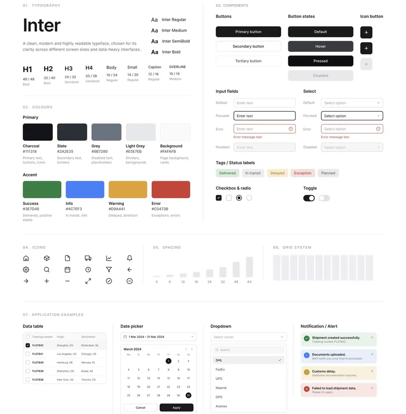
08A design system for data-heavy screens

A small, strict system keeps dense screens readable:

  • Typography: Inter in a clear scale, from 40px headings down to 10px overlines, for readability at every size.
  • Colour: a neutral base with four status colours only (success, info, warning, error), so colour always means something.
  • Components: buttons with every state, inputs, selects, status tags, checkboxes, toggles, data tables, date pickers, dropdowns and alerts.
  • Spacing and grid: a 4–64px spacing scale and a 12-column grid.
FLUX design system: typography scale, colour palette, buttons, inputs, tags, icons, spacing, grid and examples such as a data table and date picker
The FLUX design system.

09What I’d measure

  • Time from opening the dashboard to finding a delayed shipment.
  • Clicks needed to resolve a typical issue, before and after.
  • Errors and edits after bulk creation.
  • Short interviews with dispatchers after a week of real use.
In short

A dashboard is not a place to show all the data. It’s a place to decide what to do next.

Have a project like this?

Let’s make yours clear, calm and easy to use.

Tell me what you’re working on, and I’ll send you a short brief made for your project.

Start a project