Back to the site

Case study · Travel · 2026

TRVL

A travel app designed for iPhone Duo, a foldable phone. Closed, it keeps the next useful thing within reach. Open, the wider screen becomes a planning space where your plan and the map are visible side by side.

IndustryTravel
RoleProduct design, UX/UI
DeliverablesMobile app, cover & inner screens
PlatformiPhone Duo (foldable)
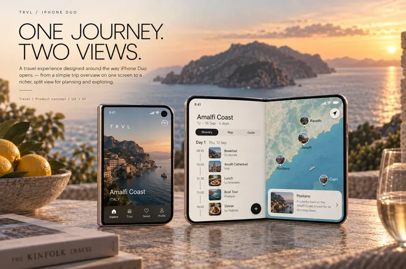
TRVL app on iPhone Duo: the closed cover screen showing Amalfi Coast and the open screen with itinerary and map side by side
Closed and open: a glance on the go, a planning space when unfolded.

01The idea

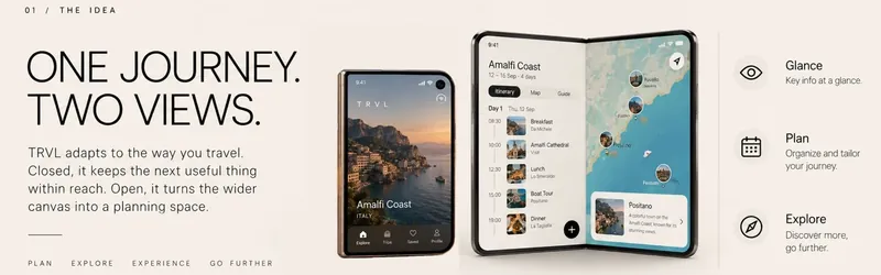
Most apps treat a foldable phone as a phone with a bigger screen and simply stretch the layout. But the two states are used in very different moments. Closed, you are walking to a gate or looking for a restaurant: you need one answer, fast. Open, you are sitting down and planning the next day: you want to see more at once.

TRVL gives each state its own job instead of one layout for both.

The TRVL idea: one journey, two views, glance, plan and explore
One journey, two views: glance, plan, explore.

02Closed: the next useful thing

The cover screen shows only what matters in the next hour: the weather where you are heading, your next flight with the time left to departure, terminal and gate, and quick actions. Nothing to scroll and nothing to search, just a glance on the move.

03Open: plan and place, side by side

Unfolded, the day becomes a timeline on the left (breakfast, a visit, lunch, a boat tour, dinner) and an interactive map on the right. Choose a stop and it’s highlighted on the map with a short card about the place. The plan and the place are visible at the same time, instead of one screen replacing the other.

04Three moments of a trip

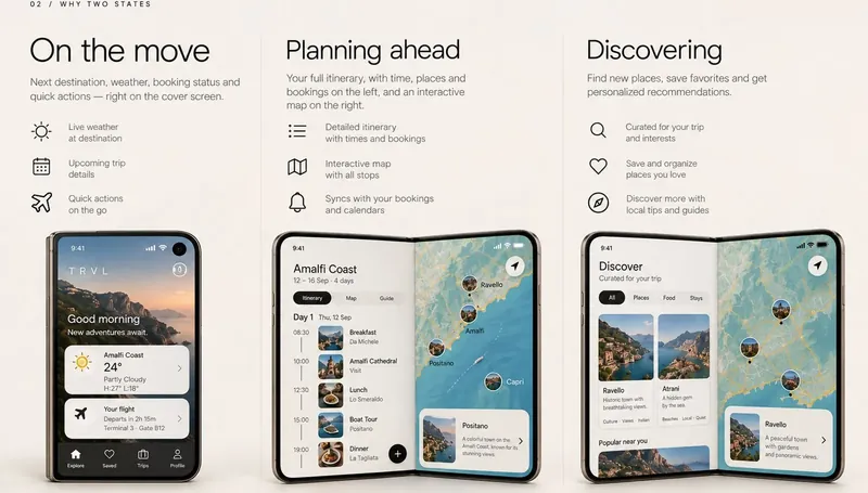
  • On the move: next destination, weather, booking status and quick actions on the cover screen.
  • Planning ahead: the full itinerary with times, places and bookings, plus the map, synced with your bookings and calendar.
  • Discovering: places curated for the trip and your interests, saved favourites and local tips.
TRVL three states: on the move cover screen, planning ahead with itinerary and map, and discovering places
On the move, planning ahead, discovering.

05Warm, calm, timeless

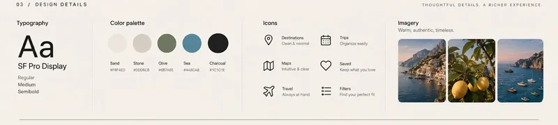
Travel apps often shout with bright gradients and badges. TRVL takes its colours from the places themselves: sand, stone, olive, sea and charcoal. SF Pro Display keeps it native to the platform, line icons stay light, and the imagery is warm and real rather than glossy.

TRVL design details: SF Pro Display typography, a sand, stone, olive, sea and charcoal palette, line icons and warm travel photography
Typography, palette, icons and imagery.

06What I’d test next

  • Continuity when unfolding. The app should open exactly where the person was, never back to the start.
  • One-handed use of the cover screen while carrying bags.
  • How often people switch between states during a travel day, and what triggers the switch.
In short

The screen gets wider. The journey gets clearer.

Have a project like this?

Let’s make yours clear, calm and easy to use.

Tell me what you’re working on, and I’ll send you a short brief made for your project.

Start a project