Back to the site

Case study · Healthcare & aesthetics · 2026

LUMI

A website for a private health and aesthetic clinic in Hampshire, designed around one goal: help people who are nervous about a treatment find the answers they need and book without friction.

IndustryPrivate healthcare & aesthetics
RoleUX/UI & web design
DeliverablesWebsite, booking flow, UI kit
PlatformsMobile & desktop web
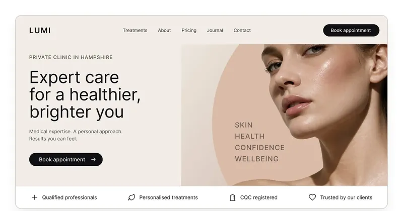
LUMI clinic website home page: headline “Expert care for a healthier, brighter you”, booking button in the header and a trust bar with CQC registration
Home page on desktop, with the booking button in the header and the trust bar under the hero.

01The brief

Most people who visit a clinic website arrive with the same three questions: what do you offer, how much is it, and can I book? Yet many clinic sites hide the answers behind long pages, stock photos and a contact form that promises to “get back to you”.

LUMI needed the opposite. A site that feels calm and premium, shows that the clinic is medically qualified, and makes booking the easiest thing to do on every page, especially on a phone, where most visitors arrive from Google or Instagram.

02Who it’s for

People considering a treatment are often a little anxious. They compare several clinics, look for signs of trust and want to understand the process before they commit. Four things matter to them most:

  • proof that the clinic is safe and qualified, such as CQC registration and qualified practitioners;
  • clear treatments and prices, without having to call;
  • a feeling of what the place is like, so it doesn’t feel like a leap into the unknown;
  • a quick way to book when they are ready, without filling in a long form.

03Booking, always one tap away

The Book appointment button sits in the header and stays there on every page. It repeats at the natural decision points: after a treatment description, next to prices and at the end of the About page. Most visitors come with one goal, which is to book, not to read, so the site never makes them hunt for the next step.

04Answers before the questions

Location, opening hours and the main treatments are visible without scrolling. Directly under the hero, a slim trust bar answers the quiet worries in four short lines: qualified professionals, personalised treatments, CQC registered, trusted by our clients. Every treatment line shows its duration and price, so nobody has to ask.
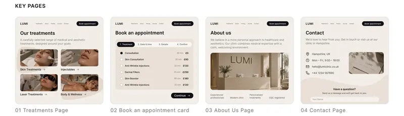
Four key pages of the LUMI website: treatments, booking card, about us and contact
Key pages: treatments, the booking card, About and Contact.

05A four-step booking flow

Instead of one long form, booking is split into four short steps with a clear progress bar: treatment → date & time → details → confirm. Each step asks for one decision only. Available times are large, tappable buttons rather than a dropdown, and the Continue button is always in the same place.

Breaking the form up does two things. It makes each step feel quick, and it lets the clinic see exactly where people drop off, so the flow can be improved with real data rather than guesses.

06Mobile first, not mobile later

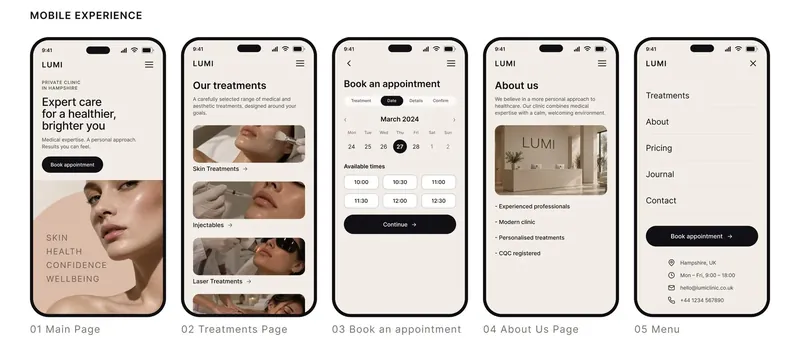
Every page was designed at phone width first and then expanded for desktop, not the other way round. On mobile the menu doubles as a contact card: address, opening hours, email and phone sit right under the links, with the booking button always in reach of a thumb.

LUMI mobile screens: home, treatments, booking calendar with time slots, about us and the menu with contact details
Mobile: home, treatments, booking, About and the menu with contact details.

07Calm, premium, clinical but not cold

The visual language had to reassure without looking sterile. Warm neutrals and skin tones replace the usual clinical blue. Inter keeps the text clean and easy to read, and a single dark pill button carries every important action, so the eye always knows where to go.

#0F0F14
#595445
#F2EDE7
#F3F3F4
LUMI style: colour palette, Inter typeface and UI elements including the primary booking button and icon style
Colours, typeface and UI elements.

08What I’d test next

  • Drop-off by step. Which of the four booking steps loses people, and why.
  • Exact prices or “from” prices on treatment pages, and which one leads to more bookings.
  • A before-and-after gallery shared with patient consent, and whether it builds trust or puts people off.
  • Reminders by text message to reduce no-shows after booking.
In short

A clinic website works when it answers the three quiet questions (is it safe, how much, can I book) before visitors have to ask them.

Have a project like this?

Let’s make yours clear, calm and easy to use.

Tell me what you’re working on, and I’ll send you a short brief made for your project.

Start a project
